Decorating 101: color & pattern selection
Here, in its most basic form, is the process I use to decorate a room. First ask questions: What do you like or dislike about the room? What do we have to work with as far as existing furnishings, art, rugs, etc.? What can be used as-is and what needs to be reworked or reupholstered? There are actually many, many more questions, but you get the idea. Assess what you have and figure out where you want to go with it.
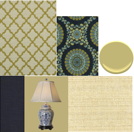
The swatches, below, represent an actual project I am currently working on. In addition to a couple of pieces of furniture, one thing the client loves are her blue and white lamps. I agree. They are lovely. However, this woman is young, energetic and fun. Her formal living room and furniture, much of it inherited, does not suit her style. So we’re keeping the lamps and building from there. I found the contemporary floral fabric that I knew she would love (and she does). It looks great with the deep blue from the lamps and also incorporates other shades of blue as well as citrine and bronze. This fabric is our inspiration piece.

Top row: Robert Allen fabrics; Benjamin Moore paint/Bottom row: Robert Allen fabric; East Enterprises lamp; Fairfield Chair fabric
The floral fabric would be too much pattern if we used it on a large piece, such as a sofa, so we chose to use it on some lovely French chairs that the client already owns. They are very traditional so the contemporary fabric gives them a kick! The sofa, instead, will go neutral and soft (swatch in lower right). We chose to reupholster the client’s existing sofa as the lines are classic and the quality of construction is excellent.
We needed a patterned, but less busy fabric, for a large chair and ottoman, so we chose the quatrefoil design (upper left). The scale is larger than the floral, It incorporates the citrine color as well as the neutral beige of the sofa, and the texture is nubby and comfortable.
We pulled the darkest blue from the floral fabric to use on the draperies (lower left). In linen, this fabric will be simple and casual. Finally, we chose the only color from the inspiration fabric that could work on the walls, citrine, and did it in a lighter tint (upper right). A slightly paler version will go onto the ceiling.
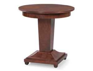
We will add accessories, of course, and a few occasional tables like the beautiful one above. The warmth of the wood coordinates with the client’s existing furniture, but the lines are clean and contemporary.
Good design takes time and this project has just begun. Once it’s all complete, I’ll share the finished product with you.
The lesson here is to find your inspiration piece and build your room from there. Various textures and pattern scale keep things looking coordinated but not too matchy and boring. Then, build the next room from the first and so on. This is how to achieve flow and continuity throughout your home.
Or you could call me and we’ll work on things together!
For resources and details – www.merrypowell.com/getintouch


Leave a Reply
You must be logged in to post a comment.